The hospitality and food industry moves at breakneck speed. Restaurants, cafés, and bars fight for attention in crowded marketplaces where customers scroll past dozens of options before making their choice. What makes someone stop and book a table? Often, it's not the menu description or even the reviews. It's the colours that catch their eye first.
Before anyone tastes your signature dish or sips your craft cocktail, colour has already begun to shape their appetite and purchasing decisions. That split-second visual impact can determine whether someone feels hungry, trusting, or excited about your venue. Colour psychology isn't just a theory for food marketers. It's a powerful tool that shapes everything from menu design to interior décor, from social media campaigns to food photography.
Smart hospitality venues know that colour influences consumer behaviour long before the first bite. Understanding which colours trigger appetite, build trust, or signal premium quality gives restaurants and cafés a competitive edge. The right colour palette across your hospitality marketing can transform browsers into bookings and first-time visitors into loyal customers.
Colour works on our appetites before we even realise it's happening. The right shade can make mouths water from across the street, while the wrong one sends potential customers scrolling past. Every colour choice, from logo to lighting, either draws people in or pushes them away.
Certain colours naturally enhance appetite while others suppress it. Red, yellow, and orange activate hunger signals in the human brain. These warm tones increase heart rate and create a sense of urgency, making food seem more appealing. Red stimulates appetite by triggering excitement and passion. Yellow sparks optimism and energy. Orange combines both effects, creating warmth and approachability.
Blue, grey, and purple work differently. Blue foods rarely occur in nature, so our brains associate this colour with caution. Studies show the colour blue can suppress appetite, making it risky for food marketing unless you're promoting drinks or diet products.
One famous experiment from the 1970s found that consumers reported feeling ill when presented with a perfectly edible steak dyed blue. The visual appearance alone overrode the actual taste experience.
McDonald's golden arches. KFC's red and white stripes. Burger King's red, yellow, and orange logo. Fast-food branding relies heavily on red and yellow because these colours simultaneously affect appetite and behaviour. Red creates urgency and triggers impulse purchases. Yellow grabs attention faster than any other colour, making it perfect for roadside signage. Food technologists have studied these effects for decades, understanding that we eat with our eyes first.
This colour combination works on multiple levels. Red and yellow together stimulate appetite while creating feelings of speed and efficiency. They heighten nerve impulses and increase energy levels. Fast food restaurants use these colours throughout their spaces, from packaging to seating areas.
The psychological impact drives quick decisions and faster table turnover. Generally speaking, these warm colours create a psychological expectation of satisfying, indulgent meals, which younger consumers particularly respond to.
Heinz learned about colour psychology the hard way. Their green ketchup initially boosted sales through novelty, but customers quickly rejected it. The colour didn't match expectations for tomato products.
Similarly, Crystal Pepsi failed despite tasting identical to regular cola. Clear liquid signalled something different from what consumers expected from cola. This classic example shows how consumer perceptions override actual taste when colour association doesn't align with the likely taste.
Mismatched colours create cognitive dissonance. When visual appearance contradicts expected flavours, customers lose trust. Blue wine, purple carrots, or black burgers might generate social media buzz, but they often struggle with repeat purchases.
The lesson? Novelty attracts attention, but consistency between colour and taste builds brand loyalty. Product packaging must respect established colour-flavour relationships to support well-being and satisfaction among customers.
Every colour carries its own emotional language that speaks directly to customer psychology. Some shades whisper luxury while others shout excitement. The most successful restaurants and cafés understand this visual vocabulary, using specific colours to evoke specific emotions and drive desired actions.
From the warmth of red, which speeds up ordering, to the calm of blue, which encourages lingering, each colour plays a distinct role in shaping the dining experience and influencing purchasing decisions. Different food categories require different colour strategies, with darker shades working for premium products while lighter tones suit casual dining.
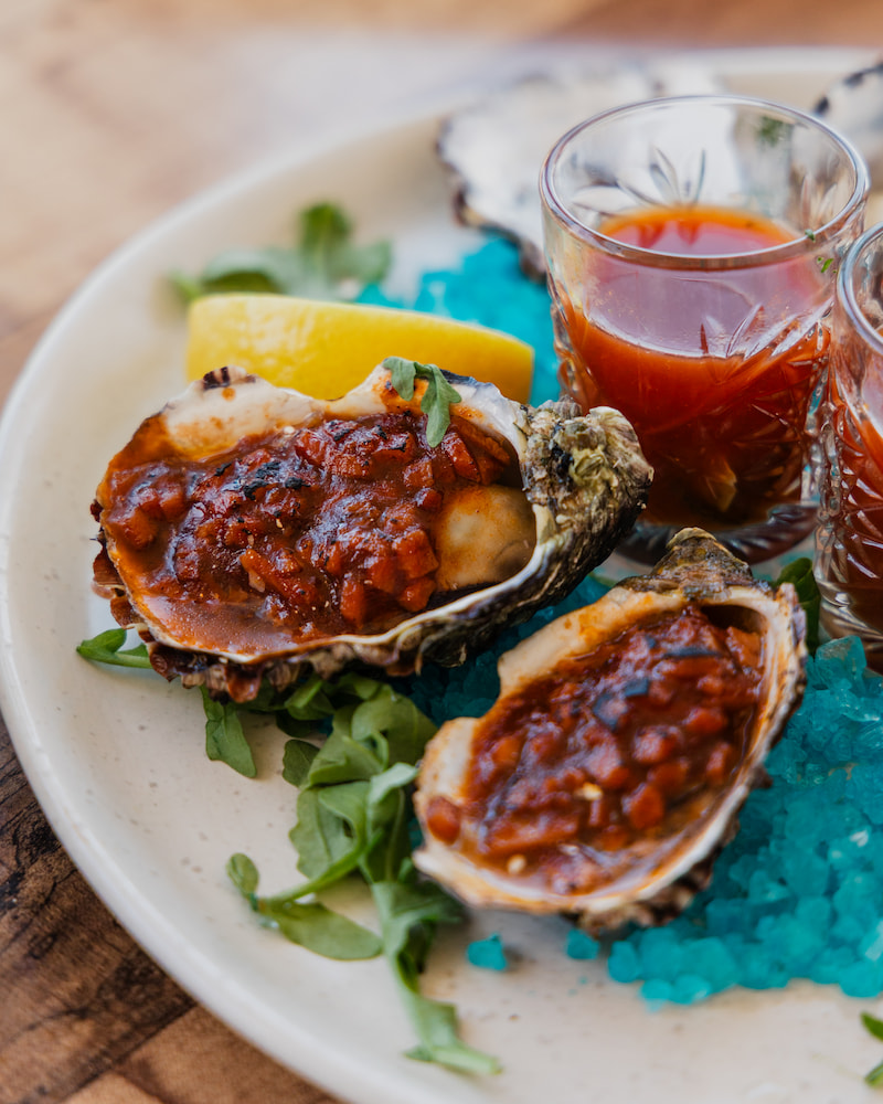
Red dominates food marketing for good reason. It triggers physiological responses that enhance appetite and create excitement. Coca-Cola built an empire on red branding. Pizza chains use red to signal hot, fresh food. Cocktail bars employ red lighting to create intimate, energetic atmospheres.
For restaurants and cafés, red works brilliantly in limited doses. Use it for menu highlights, special offers, or call-to-action buttons on websites. Red photography backgrounds make dishes pop on social media. Photography services that understand colour psychology can capture food in ways that trigger immediate hunger responses.
Yellow brings sunshine and happiness to food brands. It's the colour of optimism, creativity, and affordability. Subway uses yellow to signal fresh, customisable options. Lay's chips use yellow to evoke their classic flavour. Local cafés often choose yellow accents to create welcoming, cheerful spaces.
Orange blends red's energy with yellow's friendliness. It suggests fun, affordability, and approachability. Fanta owns orange in the beverage space. Reese's combines orange with brown for indulgent foods. Orange works particularly well for juice bars, casual dining, and breakfast venues. Professional video production can capture orange-lit scenes that make morning menus irresistible.
Green speaks directly to health consciousness. It signals natural ingredients, organic products, and environmental responsibility. Whole Foods built its brand identity around green. Green Giant owns the frozen vegetable category. Starbucks uses green to balance their coffee heritage with eco-friendliness.
Modern consumers associate green with wellness and sustainability. Salad bars, juice shops, and health-focused restaurants benefit from green branding. It reassures customers about nutritional value and ethical sourcing.
Green packaging for takeaway containers reinforces messages about environmentally friendly products. Organic food brands rely on green to communicate authenticity and health benefits.
Blue creates calm and builds trust, but use this colour cautiously in food contexts. Water brands love blue for obvious reasons. Diet products use blue to suppress appetite intentionally. Seafood restaurants employ ocean blues to reinforce freshness and origin. Light blue packaging suits beverages and dairy, while darker shades work for premium water brands. The calm blue atmosphere of upscale lounges encourages more extended visits and higher spending.
The challenge with blue foods lies in human colour perception. Apart from blueberries and some seafood, blue rarely appears naturally in food. This makes it powerful for beverages but risky for solid foods. High-end brands sometimes use deep blue to signal premium products and sophistication. The key is matching blue to appropriate food categories that enhance rather than contradict expectations. Such products need careful consideration of how this uplifting colour might actually work against appetite stimulation.
Purple signals luxury and indulgence. Cadbury owns purple in chocolate. Wine brands use purple to suggest richness. The colour purple works for desserts, cocktails, and special occasion dining. It evokes specific emotions around treating yourself and celebration. Dark purple particularly appeals to sophisticated audiences seeking premium experiences, while lighter shades attract younger demographics.
Black communicates elegance and exclusivity. Premium coffee brands like Nespresso use black extensively. Energy drinks leverage black for intensity. Craft beer and spirits employ black labels to stand out. Black food packaging suggests sophistication but requires careful balance to avoid looking heavy or unappetising. As an accent colour, black adds drama and premium positioning to any product category.
White represents purity and simplicity. The colour white naturally appears across dairy products, reinforcing freshness. Minimalist restaurants use white to let food colours shine. Dairy brands rely on white to signal freshness and natural foods. White space in menu design creates a premium perception. Clean, white social media feeds suggest quality and attention to detail. Product packaging featuring white communicates transparency and honesty about ingredients.
| Colour | Mood/Emotion | Food & Beverage Associations | Impact on Sales | Hospitality Application |
|---|---|---|---|---|
| Red | Energy, urgency, appetite stimulation | Fast food, berries, cocktails | Boosts appetite, drives impulse orders | Use in menu highlights, bar lighting, posters |
| Yellow | Optimism, creativity, cheer | Fries, honey, citrus drinks | Sparks hunger + positivity | Seasonal campaigns, café menus |
| Orange | Warmth, fun, affordability | Juices, snacks | Appetite stimulant | Juice branding, casual dining décor |
| Green | Freshness, health, eco-friendly | Salads, organic dishes | Signals health-conscious choice | Menus for healthy items, eco branding |
| Blue | Calm, trust, appetite suppressant | Water, diet products | Reduces appetite (except drinks) | Calm café ambience, drink branding |
| Purple | Luxury, indulgence | Grapes, wine, chocolate | Premium positioning | Cocktail menus, dessert promotions |
| Black | Elegance, masculinity, exclusivity | Coffee, alcohol, energy drinks | Premium/high-value perception | Bar menus, fine dining branding |
| White | Cleanliness, purity, simplicity | Milk, yoghurt, cheese | Signals freshness & minimalism | Minimalist menus, brand identity |
Colour psychology extends far beyond individual dishes or drinks. Different demographics respond to colours in unique ways, shaped by age, culture, and personal experience. What excites a child might repel an adult. What signals premium quality in Sydney could mean something entirely different in Singapore. Understanding these nuances helps hospitality businesses craft visual strategies that resonate with their specific target audience rather than relying on one-size-fits-all approaches. Certain flavours naturally align with particular colours across product categories, creating universal expectations that smart marketers leverage.
Children gravitate toward bright, artificial colours. They prefer intense yellows, electric blues, and hot pinks. Snack brands targeting kids use rainbow palettes and neon shades. Birthday party venues embrace colour chaos because it signals fun and excitement to young minds. Red packaging on lollies and bright accent colours on cereal boxes specifically target this demographic's preferences.
Adults shift toward natural, muted tones. Earth tones suggest authenticity. Pastels feel sophisticated. Golden brown signals freshly baked goods. Bakery brands targeting adults use warm, comforting colours rather than bright primaries. Understanding your target audience's age helps select colours that resonate rather than repel. Younger consumers respond differently to the same colour strategies that appeal to mature diners seeking refined experiences.
Colour meanings shift across different cultures. Red symbolises luck and prosperity in Chinese culture, making it perfect for Lunar New Year campaigns. White represents purity in Western contexts but mourning in some Asian cultures. Green holds religious significance in Islamic countries.
Successful international restaurants adapt their colour strategies to local markets. McDonald's uses green in European locations to appear more eco-conscious. KFC emphasises different colours in different meanings across global markets. Cultural sensitivity in colour choices prevents misunderstandings and builds stronger connections with diverse audiences.
Variety stimulates consumption. Studies show people eat more when offered multicoloured foods. M&Ms sells more candy in mixed colours than single shades. Sushi restaurants display rainbow rolls prominently. Açai bowls photograph beautifully because they combine multiple colours naturally.
This principle extends beyond individual dishes. Menus with varied colour coding help customers navigate options. Colourful food photography on digital marketing campaigns increases engagement. Social media posts featuring colour variety get more likes and shares. The human brain interprets colour diversity as choice and abundance, triggering positive responses and increased orders.
The brain processes colour faster than any other visual element, instantly creating expectations about how food should taste. When reality contradicts these visual promises, customers experience cognitive dissonance that can override even the most delicious flavours. This mismatch between expectation and experience doesn't just confuse customers. It breaks trust, damages brand credibility, and turns potential regulars into one-time visitors who won't return.
Expectation shapes experience. When colours signal one flavour but deliver another, customers feel confused or betrayed. This disconfirmation effect can ruin even perfectly good food. Clear soft drinks taste wrong despite identical formulation to brown versions. Green ketchup fails because red means tomato in consumer minds.
Novelty works temporarily, but consistency builds long-term success. Unusual colours might generate Instagram posts and initial curiosity. However, repeat purchases depend on meeting expectations. Blue wine might photograph beautifully for influencer marketing campaigns, but traditional wine colours sell consistently.
Smart brands use colour innovation carefully. Limited edition products can experiment with unexpected colours. Seasonal offerings provide safe spaces for colour play. The core menu should respect established colour-flavour associations. Building trust through consistent visual cues creates brand recognition and customer loyalty.
Colour strategy transforms abstract psychology into concrete results. Smart hospitality businesses don't leave colour choices to chance or personal preference. They build systematic approaches that align visual elements with business goals.
Whether launching seasonal campaigns, refreshing social media presence, or redesigning menus, strategic colour implementation drives measurable improvements in customer engagement, order values, and repeat visits. The difference between random colour selection and purposeful colour psychology shows up directly in sales figures.
Seasonal colour strategies tap into psychological associations. Autumn campaigns using orange and brown evoke comfort food cravings. Summer promotions in bright yellow and green suggest freshness and vitality. Winter menus featuring deep reds and golds signal warmth and indulgence. Spring offerings in pastel shades communicate renewal and lightness.
Successful campaigns align colours across all touchpoints. Menu photography matches interior design. Social media posts reinforce website aesthetics. Email marketing continues the visual story. This consistency strengthens brand identity while triggering appropriate emotional responses. Professional content creation services understand how colour continuity drives campaign effectiveness.
Strategic colour placement guides customer action. Red buttons convert better than blue ones. Yellow highlights draw eyes to specials. Green badges communicate healthy options. These visual cues work subconsciously, directing attention and influencing purchasing decisions.
Photography and videography that emphasise appetite-triggering colours increases conversion rates. Steam rising from golden-brown pastries. Ruby-red strawberries glistening with moisture. Emerald herbs scattered over creamy pasta. These images don't just document food. They activate hunger and desire through careful colour selection and lighting.
Instagram-worthy presentations consider colour first. Vibrant smoothie bowls. Rainbow sushi platters. Ombré cocktails that gradient from pink to orange. These dishes become marketing tools when guests share them online. The right colour combinations transform customers into brand ambassadors.
Creating shareable moments requires understanding both colour psychology and social media behaviour. Contrasting colours photograph better than monotone plates. Natural lighting enhances colour accuracy. Unexpected colour combinations generate comments and engagement. Smart venues design signature dishes with shareability in mind, knowing that user-generated content provides authentic marketing value.
Colour psychology directly influences appetite, mood, and sales. From triggering hunger with red and yellow to building trust through consistent visual experiences, colours shape customer behaviour before they read menus or taste food products.
Hospitality venues that master colour psychology gain competitive advantages. They attract more attention, trigger stronger appetite responses, and create memorable brand experiences. Whether refreshing your menu design, planning seasonal campaigns, or capturing new food photography, colour choices directly impact your bottom line.
Ready to harness colour psychology for your hospitality business? If and When specialises in creating visually compelling content that drives bookings and builds brand loyalty. From photography that makes dishes irresistible to social media strategies that stop the scroll, we understand colours and how to leverage them to make your brand pop. Let's create campaigns that don't just look beautiful but strategically use colour to grow your business.
If and When specialises in creating visually compelling content that drives bookings and builds brand loyalty.